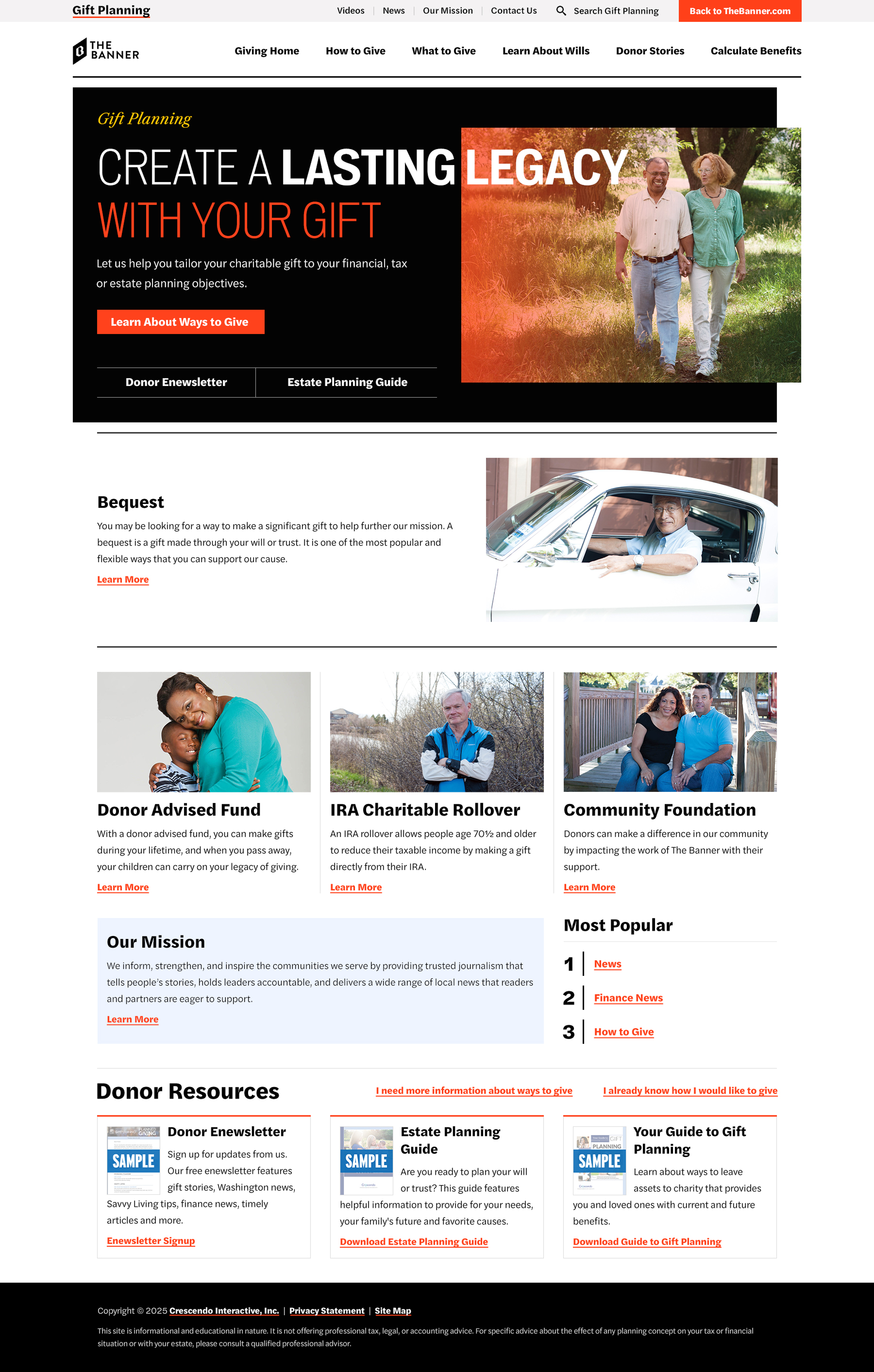
Here is a redesign I did for The Banner's Philanthropy department. The most significant updates focused on alignment and proximity, following core design principles. For a page to feel professional, clean, and intentional, elements must align to a clear grid, especially on the web where structure is critical. The previous version did not follow a consistent grid or alignment system, which caused the layout to feel unstructured.
I also updated the hero and banner image to better align with The Banner’s brand standards by prioritizing clarity, hierarchy, and readability while supporting how users naturally scan and process information on the page. This helps the most important messaging land quickly and clearly.
In addition, I converted the images to black and white to create greater visual consistency across the page. Since we do not currently have strong photography to rely on, using a duotone approach helps unify the layout and shifts focus away from individual images and toward the overall structure and hierarchy of the page.
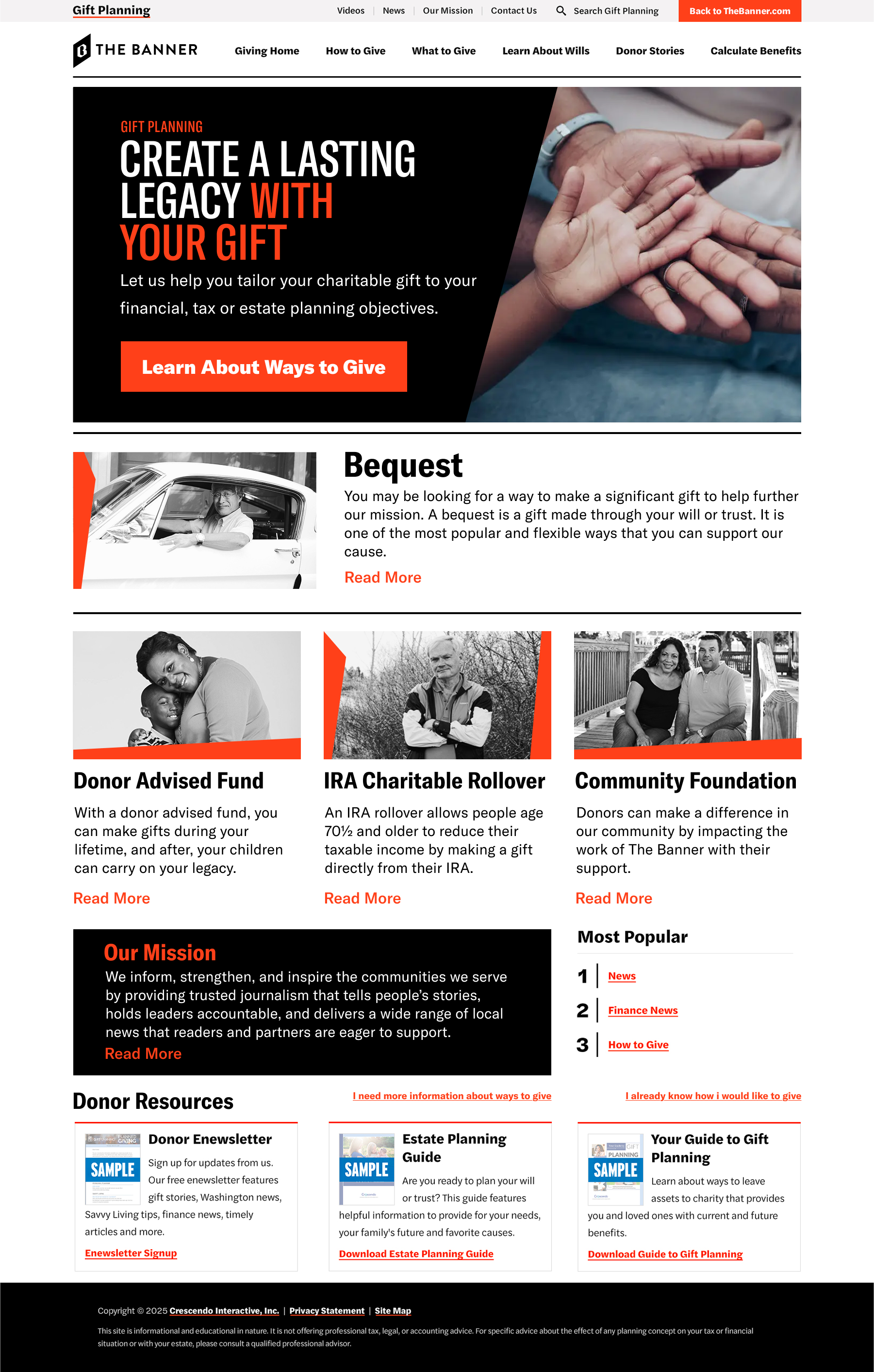
Old Design